Iconography
Most of what I do is tweak existing designs. When creating a new sign or icon, it's often best to go with a design that matches what a user is already used to. Familiarity aids recognition and encourages correct interpretation of new information. As such, a lot of the work I've done flies under the radar in spaces where the original designs aren't mine. Nonetheless, here are a few small projects that were done from scratch.
Navigating light rail
Spring 2022

I created these icons for a simple pictorial navigation project. The goal was to help people navigate from the airport using public transit. One of the challenges in visually representing directions is depicting the and the in a simple, unified way. How do you show people what to look for, and simultaneously explain what they should do? The instructions were intented for people with different abilities to read maps or understand written directions.
First steps
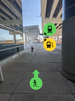
The instructions start at the baggage claim.
Icons overlayed over real pictures of the target can redundantly aid text such as
“ towards the ” and “go the .”


The first photo is taken from where you would stand as soon as you exited security and arrived at the baggage claim. These instructions were designed to be easy to follow. Any search algortithm, including the ones that we use while scanning the horizon for a target, will be faster and more accurate when the search cue is identical to the . In this case, the cue is a real picture of the target (the exits) from the most likely angle a user would view it from.
It's a simple thing, but notice how the arrows pointing to the target are consistent with the direction the user needs to go.
Redundancy
![]() The icons and the pictures they overlayed were designed to be redundant aids to text instructions. The redundancy is layered within the icon design as well. Take a look at the Board Train icon. The direction of the stick figure implies boarding, but the arrow redundantly implies that action as well. The direction closely tracks with the real-world action of stepping sligthly up to board.
The icons and the pictures they overlayed were designed to be redundant aids to text instructions. The redundancy is layered within the icon design as well. Take a look at the Board Train icon. The direction of the stick figure implies boarding, but the arrow redundantly implies that action as well. The direction closely tracks with the real-world action of stepping sligthly up to board.
Full icon set
![]()
![]()
![]()
![]()
![]()
![]()
![]()
![]()
![]()
![]()
![]()
![]()